BLOG DESIGN
Interview with Richard Niessen, from Niessen&DeVries
HdB: Around two months ago I invited you to make a design for this blog. How would you like to introduce your practice to the readers of this blog?
RN: We are Richard Niessen and Esther de Vries, and we officially collaborate as graphic designers from 2008. We both studied graphic design and live and work in Amsterdam. Even though our individual work is visually quite different, we share a strong interest in close collaborations with commissioners – as a way to challenge ourselves to explore new paths. Our work varies from printed matter, exhibitions, textile, and ceramics to other objects, such as coins. Apart from creating commissioned work for (mainly) cultural entrepreneurs we also initiate our own projects, and Esther also runs a small publishing house.
In my own work I go against the grain of the dogma of unambiguity in concept which is prevalent in ‘Dutch Design’. Instead, I am trying to search for multiple layers, I would call it ‘lyrical design’: expressive and fantastic, making use of a rich visual language to address the senses and the intellect. My work is engaged, subjective and personal. It is also spontaneous, I would even say interactive and the meaning is usually ‘sedimented’ in layers. Just like in the assignment fort his blog, where also many layers add up, not in an immediate transparent way, but still clear. In my work it is always possible to find some hidden secrets.
HdB: What was the starting point for the design?
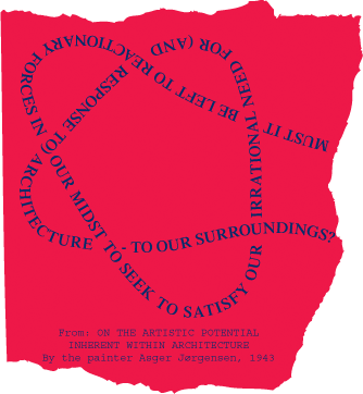
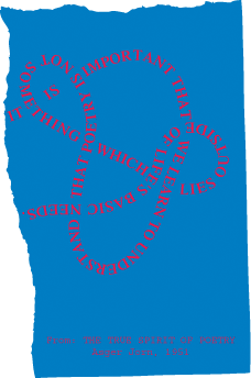
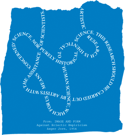
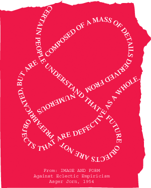
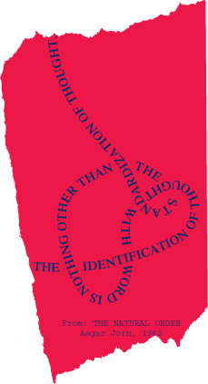
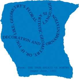
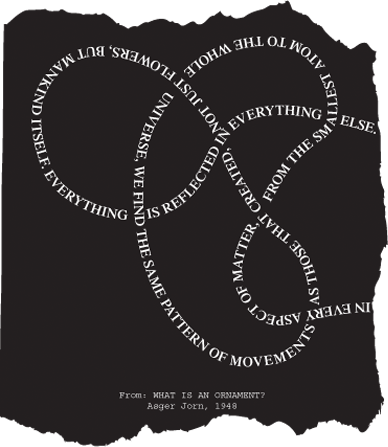
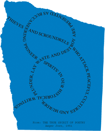
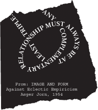
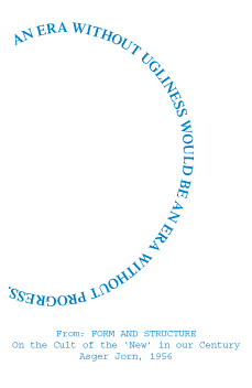
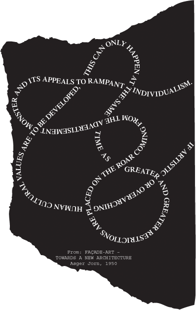
RN: The starting point for the design was built by the idea of the postmark, the ones that you find on air mail. These postmarks often include wave and circle shapes, which connected perfectly well to the text you send to us, ‘What is an ornament?’, written by Asger Jorn, where he speaks about waves and interference. As you were going to post, to send us messages from the land of Jorn, and considering the fact that this land mainly consists of texts, it was a very obvious starting point. After all, in a postmark text is often being used in a decorative way, readability is not the first priority – the text can take a circular shape, could be placed vertically, or in wave lines. Besides, in postmarks lines are being used, lines that could be the arabesques that Jorn is talking about in his text. The first idea was to superimpose the postmarks on the standard design of the blog in order to create a distinct identity. It seemed suitable to take some characteristic quotes from Jorn in order to create the postmarks.
HdB: Has Jorn’s text on the ornament been of any other influence?
RN: My work is less arabesque then Jorn’s ideal, it is often based on geometry and grids, resembling ‘solid building’ rather than ‘smooth curves’. In search of lines that could built the shapes of the postmarks I restricted myself to a ‘set’ of existing forms. I knew it could not be just any set of lines, in order to be able to build a system there had to be a reason to choose a particular set of lines… . This is when I thought of knots. Not only is the knot an ancient decorative motive, it also is a mathematical and natural (physical) phenomenon – and also Jorn’s sentences seem to be intertwined like knots. A knot has no beginning and no end. It seemed an exciting concept to create a typography in which Jorn’s statements would start to become ornamental, even if they don’t appear to be ornaments at first sight.
HdB: I remember being in Denmark when you told me about the knots, and phoning you slightly worried, because suddenly I realized that one of the later Situationist Times, one in which Jorn was not directly involved, but still, is entirely devoted to knots. For a moment I thought the blog design would maybe resemble this too much. But of course you were planning to move away a little bit from the knot as well. How did you do that?
HdB: Well, quite a few experiments followed: various type faces, very thick knots with integrated diapositive text, only letters …. I was trying to figure out what would happen when the lines (which are words) cross each other… And how to utilize the ornaments to create an optimum interplay? Eventually I decided to cut the knots open, creating a beginning and end after all. This way they became less hermetic, more readable and fluent, and could even be connected to each other. All quotations can now become one uninterrupted line, or a labyrinth.
HdB: And then you were still not done …
RN: The texts worked quite well on the blog but I had also decided to design a poster that you can take with you on your travels. And for the poster the design was visually too meagre, and too technical. By putting the texts on paper scraps suddenly also the brutal and manual, or physical, aspect of Jorn’s work was addressed, and the design became more dynamic and spatial: scraps lie on top and through one another. I opted for red, blue and black as a remainder to the idea of stamps and the idea of (air) mail.
HdB: What was the biggest challenge with this assignment?
RN: You approached us for our interest in playing out the tension between the decorative and the functional, and provided us with the text by Jorn, which also deals specifically with the ornament. It was an interesting challenge to not come up with something obvious, I really wanted to avoid that. So I mainly looked at Jorn’s visual work, collages of torn up paper, his series of modifications in which he paints over existing works, the Situationist work with Debord (détournement)… I am pleased that we managed to find a visual language for the project which is playful, yet clear.
